Resurrecting PCRx Flow
How I brought a core PBM application from the enterprise’s back burner to the forefront through research and communication.
Responsibilities
- User Research
- Prototyping and Feedback
- Present Recommendations to Senior Leadership
Timeline & Team
3 months, working with a BA (acting PM)
Outcomes
- Moved to top priority list for 2026 and forward, and received special funding
- CX/DX Team integrated more fully into organization
Company overview
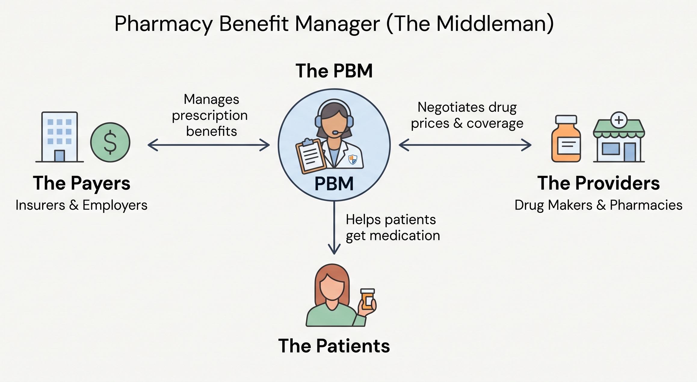
Pharmacy Benefit Manager
Custom built tools for setting up benefits, processing drug claims, and providing member & client support.
3 founding designers were hired to bring user-centered design and consistency across these homegrown apps.
Project background
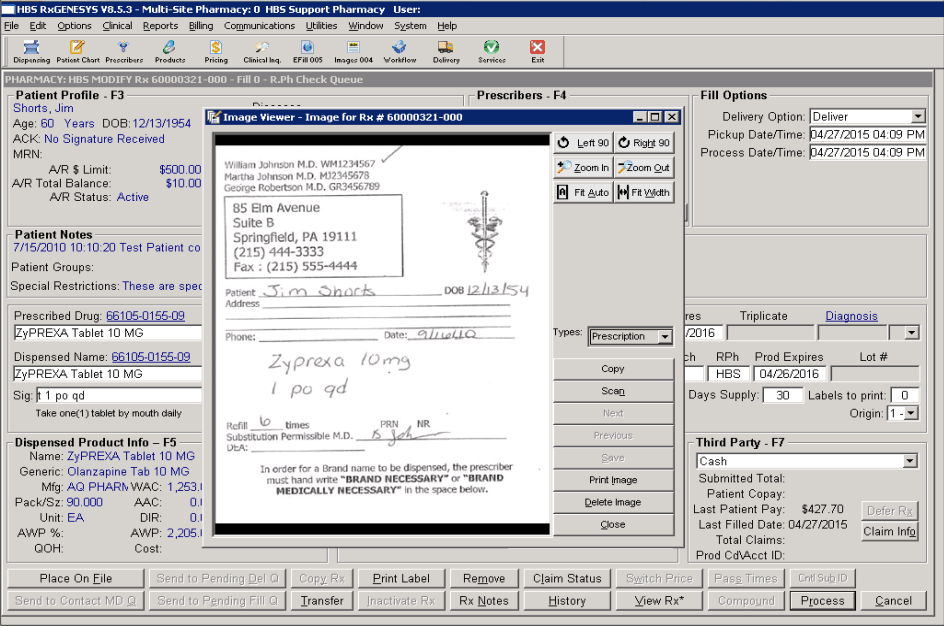
PCRx is a 20 year old desktop application that runs everything at this PBM
Used internally for everything from benefit configuration to claims adjudication, running test claims, manual claims, and tracking communications with PBM members.
PCRx Flow: a modernized version for clients
PCRx Flow was built to surface some of the PCRx data for clients. Built long before design was a practice at the enterprise, it ended up a patchwork of reactive feature additions based on client requests, built with now aging UI components.
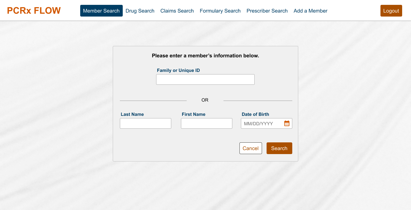
Forgotten, not much strategic attention
PCRx Flow was just one of 20+ applications at the enterprise. But it was an available area for the Customer and Digital Experience (CX/DX) team to have some influence, and it was assigned to me:
- Create a visible win for the CX/DX Team
- Solve real pain points to increase business opportunity of the application
PCRx Flow’s resurrection. Through my work, the perspective on this application would eventually totally flip. The enterprise would come to recognize the value in investing in a full redesign, and would end up moving this project to their top priority list for strategic investment in 2026.
Project summary
The approach
The CX/DX Team’s strategic objectives were to develop this opportunity into shipped work demonstrating the value of design to the enterprise, and to increase business opportunity by solving real pain points and improving perception.
-
Research & Discovery
User interviews
-
UI/UX Analysis
Heuristic analysis and design system review
-
Prototype & Validate
Demonstrate proposed changes and get feedback and validation from users
-
Present for Buy-In
Create a business case and present recommendations to senior leadership
Research & discovery
Who is the user?
“The users? Well, they’re clients.”Typical answer from associates at the enterprise, which gave little insight (“internal” or “external”)
My Business Analyst arranged for me to do 10 user interviews:
- As close to a contextual inquiry as possible in a remote setting
- “Train me how to do your job, not how to use the application”
- I wanted to understand what they did inside and outside the app so that I could identify workarounds they’ve been doing for so long they don’t notice them anymore
Identifying themes
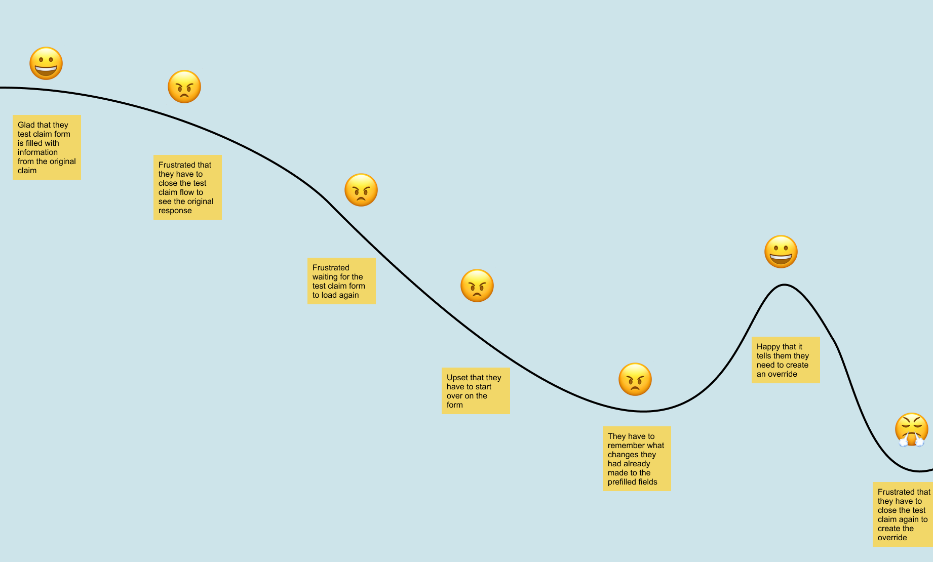
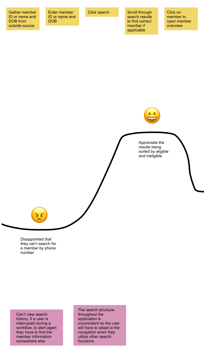
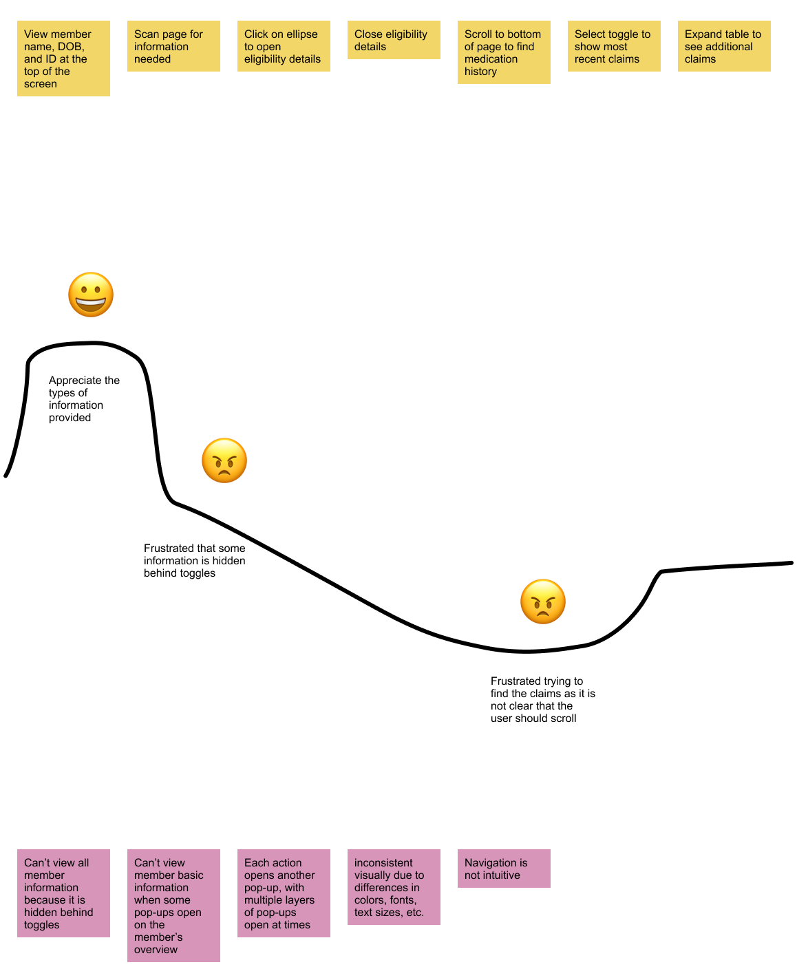
While I conducted interviews, the Business Analyst was creating a journey map. Some clear themes began to emerge around:
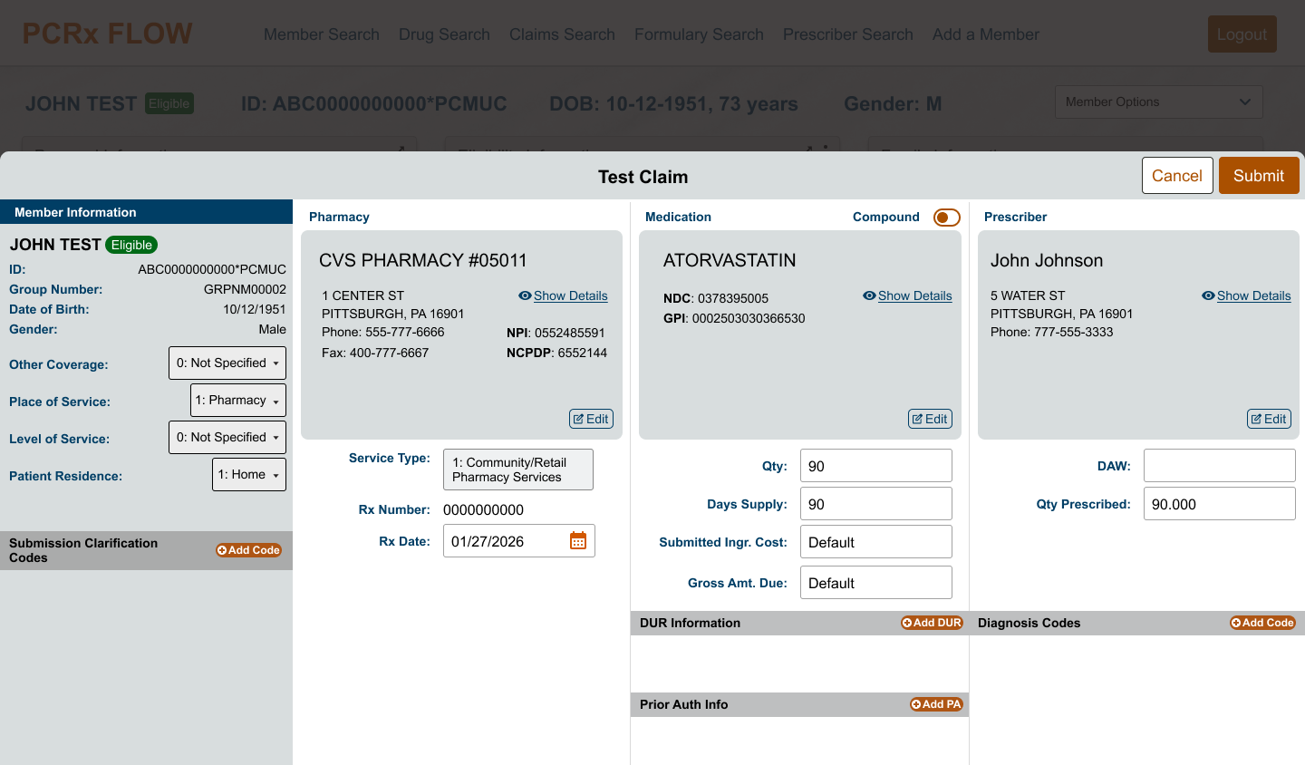
- The Test Claims flow
- The Search experience
- Some interactions designed by developers to improve performance
UX/UI analysis
Heuristics & systems
I analyzed heuristics like user control, up-to-date patterns, recall vs. recognition, and consistency & standards.
I also thought in terms of our nascent design system:
- Where will existing design system components work?
- If custom components are necessary, can I design them such that they can be added to our design library for use in other apps?
Prototype & validate
Four core recommendations to validate
Based on my research and analysis, I identified 4 things that, if improved, would deliver the most value to our users. I mocked up the proposed future state of each of these 4 core areas, and the Business Analyst and I met with users again to show the concepts. Feedback showed we were right on target.
I used Figma to mock up the concepts, and Teams to meet with users remotely.
Present for buy-in
Slide deck & business case
Business case
- The Business Analyst and Business Lead wrote the business case, and I contributed
- Improving this app and its perception and adoption would reduce calls to client support, and would eventually lead to eliminating client dependency on legacy PCRx (costly)
Design rationale presentation
I prepared a slide deck to explain my recommendations and rationale to anyone strategic. The CX team was also advocating for this and other design work with Senior Leadership behind the scenes (change management), priming things for us to make our case.
“I think we need to show this to the CX/DX Director.”Business Analyst’s response
Knowing the audience
CX/DX Director
- Operations background
- Systems thinker
- Responds to logic, reason, and data
- Often has opinions (for better or worse) about design specifics, but is willing to cede ground if you can show her grounded rationale
CTO
- A founding technical member of the enterprise who personally built a lot of the original digital tools
- The enterprise had taken a multimillion dollar profit reinvestment for 2026, and he helped set strategy for which projects were prioritized for that investment
- I was careful to present this tactfully so as to not throw the original technology under the bus, but present recommended improvements
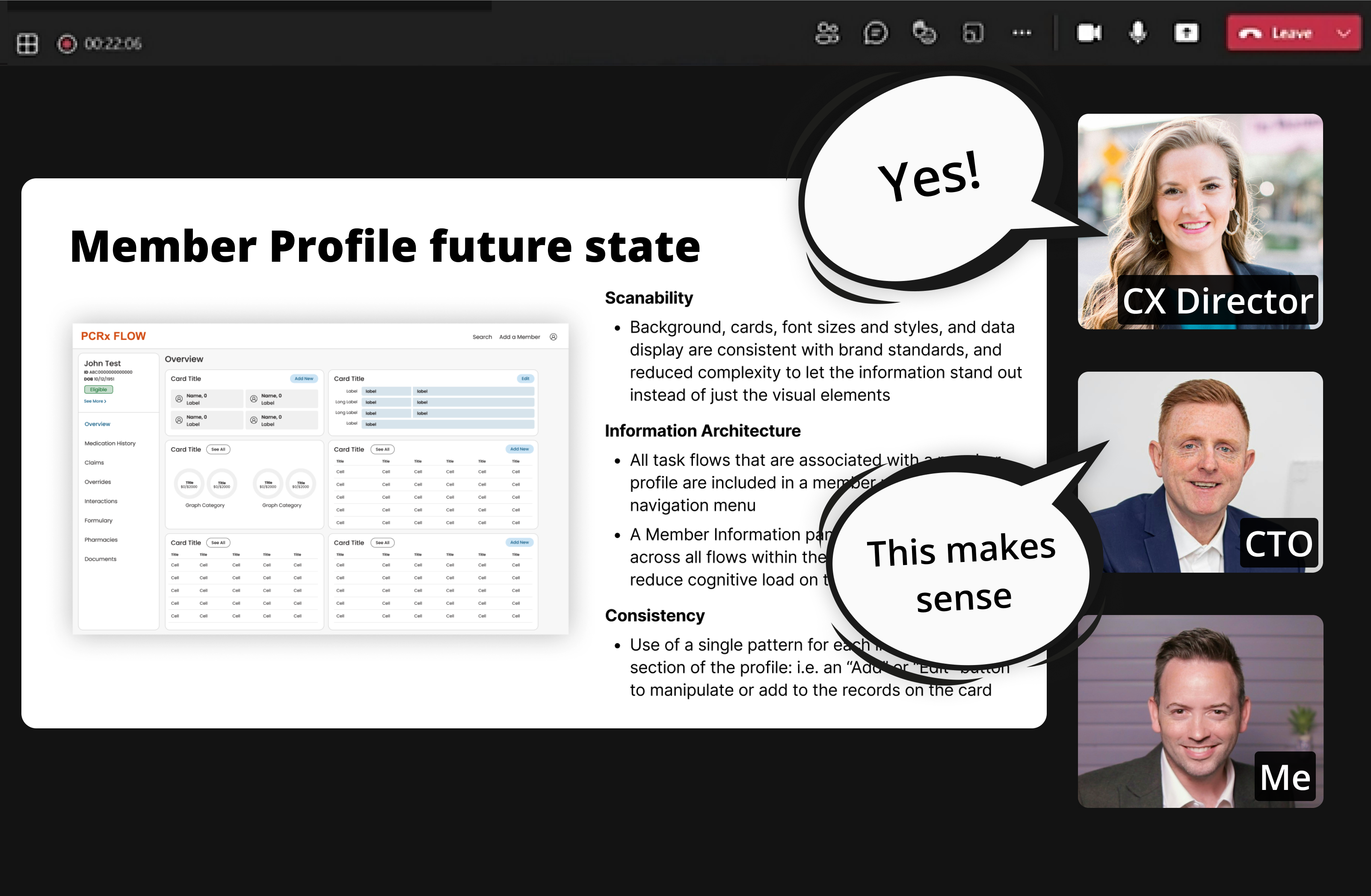
The presentation I used to solidify the CX/DX Director’s support is summarized below. It was recreated from scratch, with mockups abstracted and anonymized for confidentiality.
The presentation
What is at the core of this application?
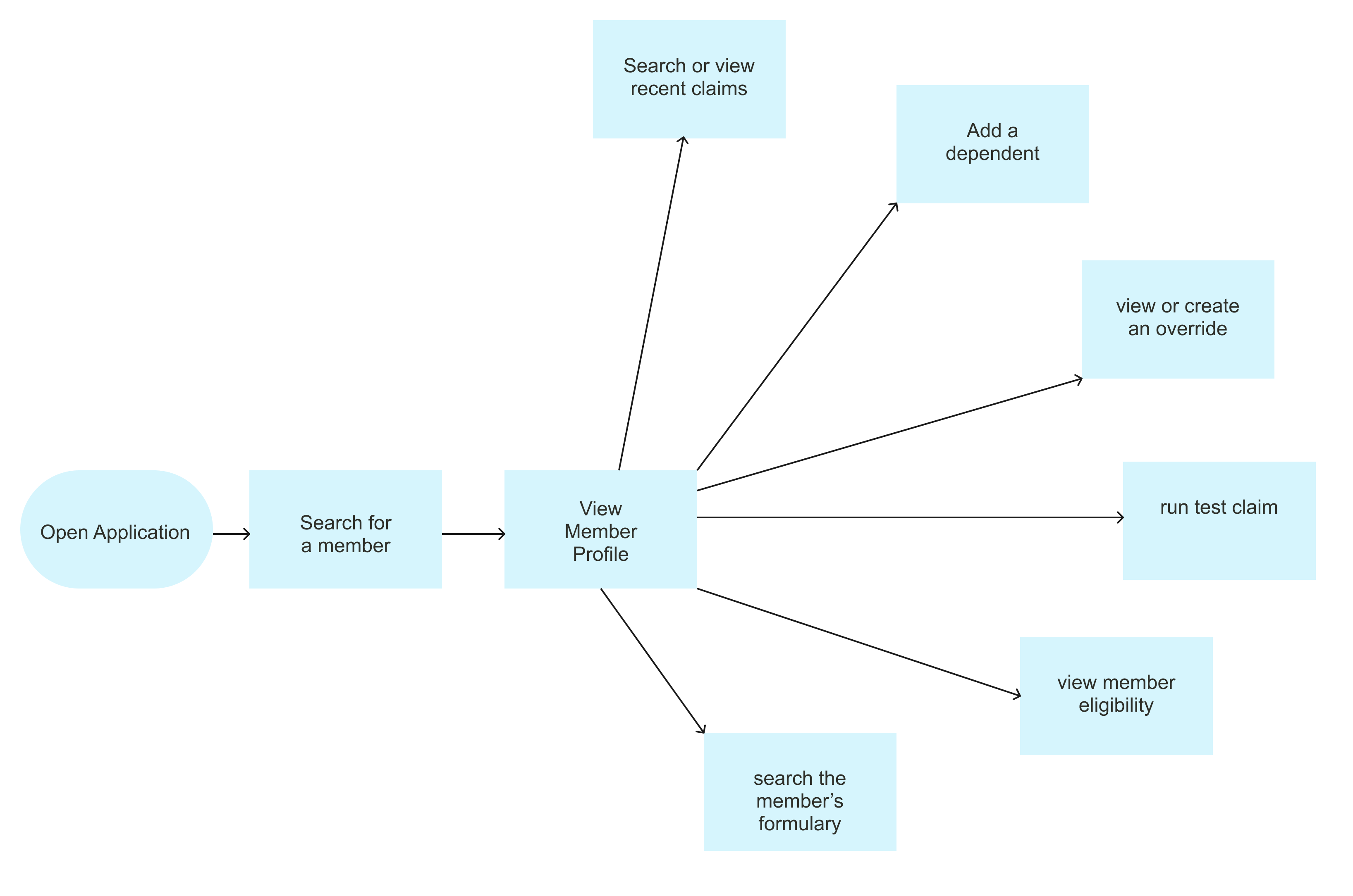
According to interviews, everything starts with a search. Especially in a call center environment, most flows revolve around a member: start by searching a member, then begin a workflow from there (another search, or drilling into a specific set of information on the member profile).
Areas of focus
Search, Member Profile, and Test Claims. The analysis combined a usability assessment against standard heuristics with the 10 user interviews to look at real user behavior and pain points.
Search
Today
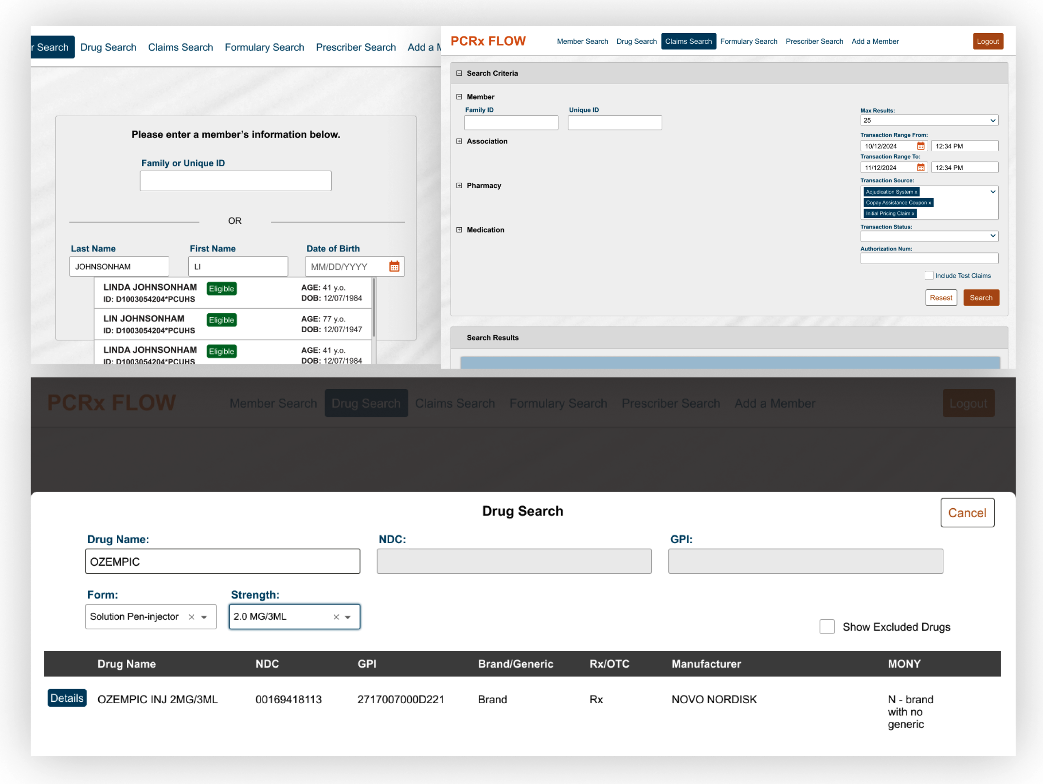
- Information architecture: each type of search has a dedicated nav bar item, some duplicated in the member profile action dropdown. Similar functionality is spread across seemingly disparate sections instead of grouped together
- Consistency: results display differently with each type of search; forms use different patterns (accordion, horizontal form, vertical form); some searches complete on input and others on click; some are dedicated pages while others are large modals
- User feedback: no search history means taking notes externally or memorizing things
Future state
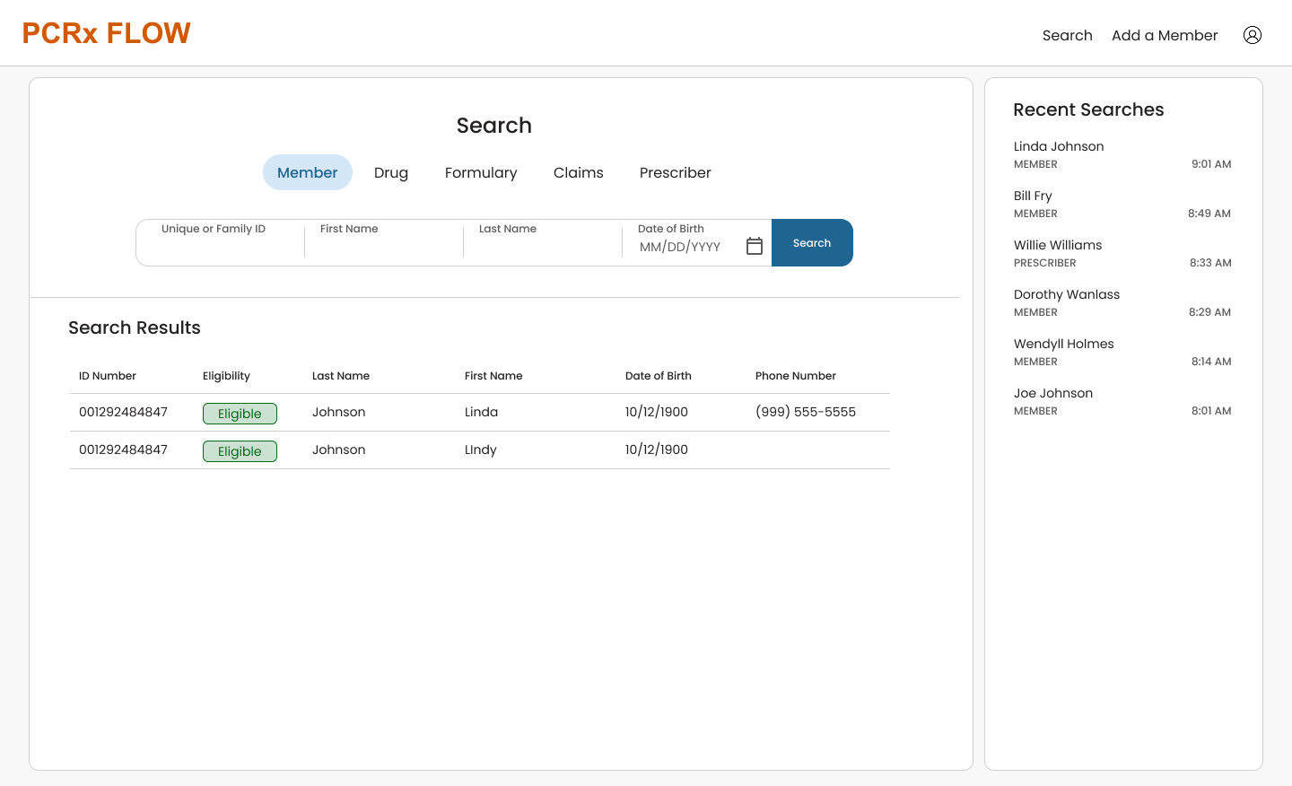
- Information architecture: all search functionality is grouped together in a single place, reducing complexity and setting clear expectations
- Consistency: results display in the same place and the same way for every type of search, and the form interaction is the same across all of them, so users don’t learn a new pattern each time
- Usability: a recent searches panel reduces cognitive load and saves time
For the future state I took inspiration from apps that live or die on their search and have complex, multi-field search bars.
Member Profile
Today
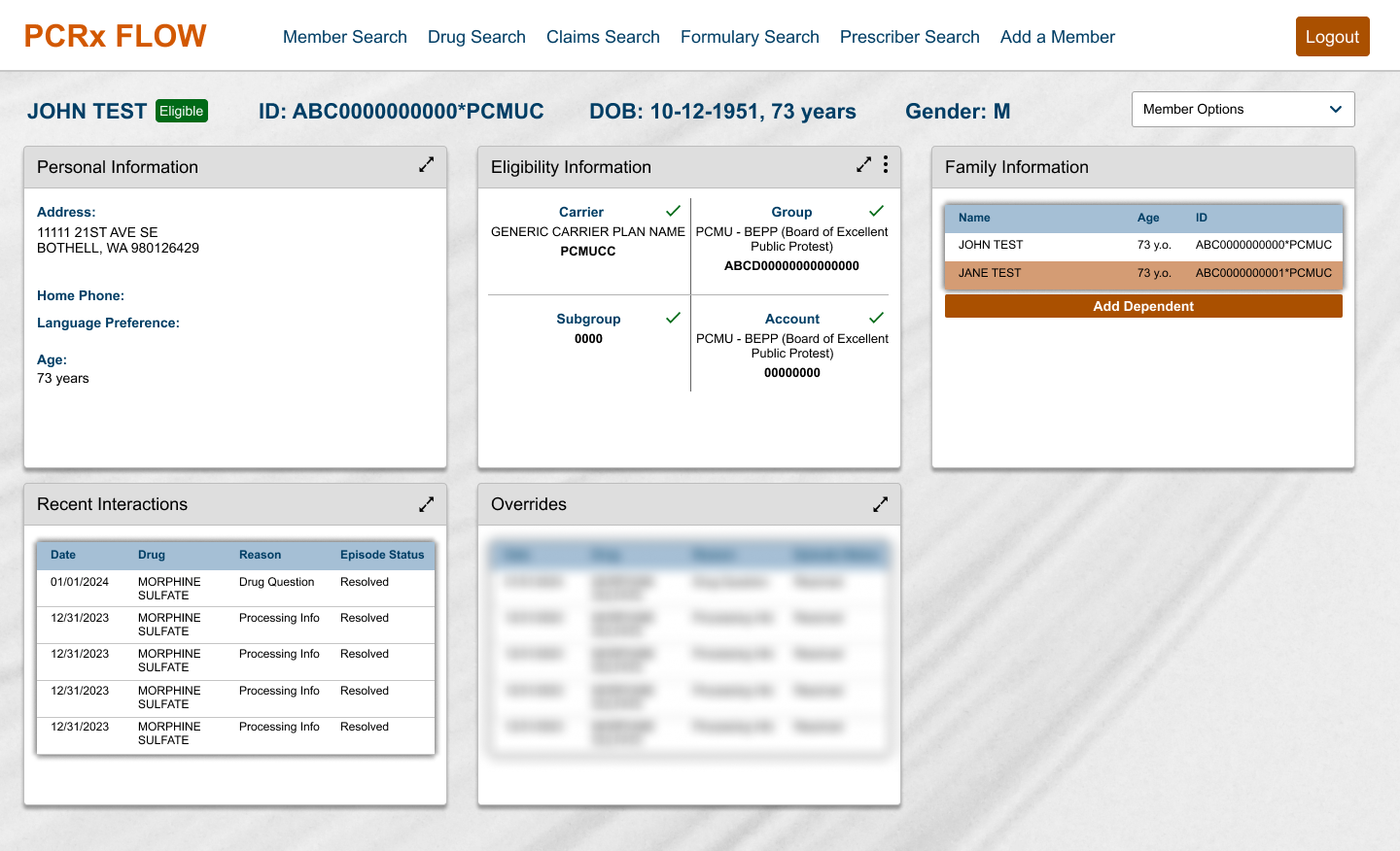
- Scanability: large cards on cards on cards, with dramatic drop shadows and bold header backgrounds, keep the focus on the UI instead of the information. Poorly organized content and oversized text require a lot of scrolling, and the background image adds clutter
- Information architecture: tasks within the member profile sit in a counterintuitive pattern (a dropdown that feels like a dashboard filter), and key member information doesn’t always persist during task flows
- Consistency: editing records is inconsistent. Eligibility uses an ellipsis menu and “Eligibility Maintenance,” while Personal Info uses expand arrows and “Edit”
- Brand: large fonts and components make the styling feel like a toy instead of a professional tool
Future state
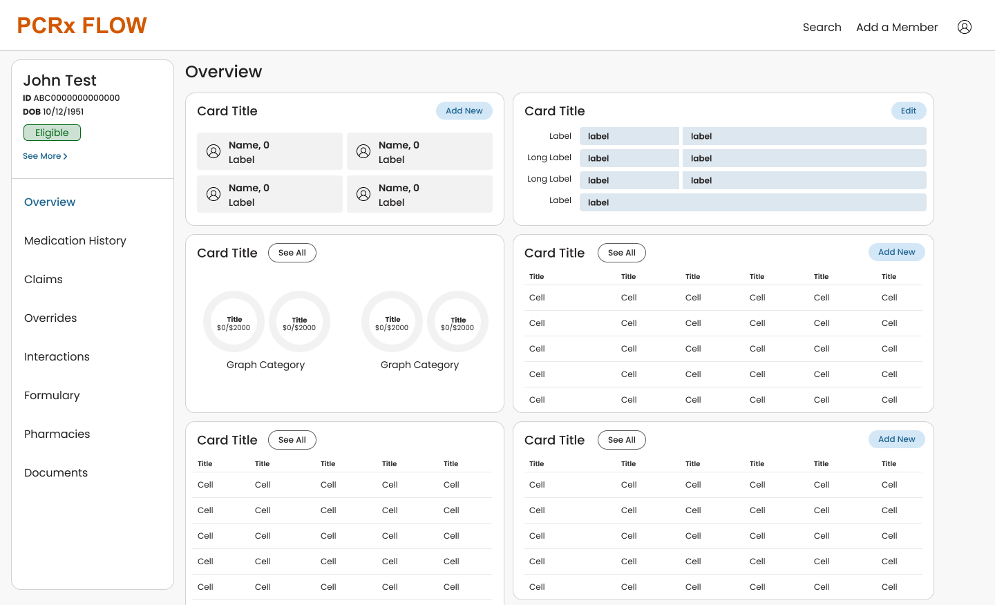
- Scanability: background, cards, font sizes and styles, and data display are consistent with brand standards, with reduced complexity so the information stands out
- Information architecture: all member task flows live in a member profile-specific navigation menu, and a Member Information panel at the left persists across every flow to reduce cognitive load
- Consistency: a single pattern for each interaction with a section of the profile, such as an “Add” or “Edit” button on the card
Test Claims
Today
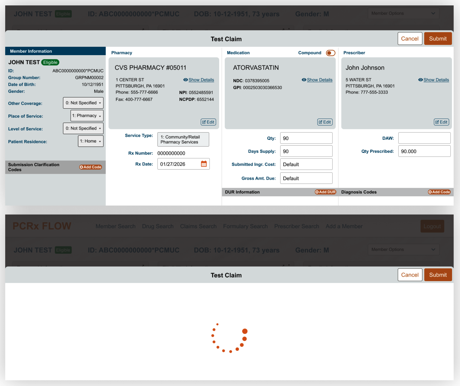
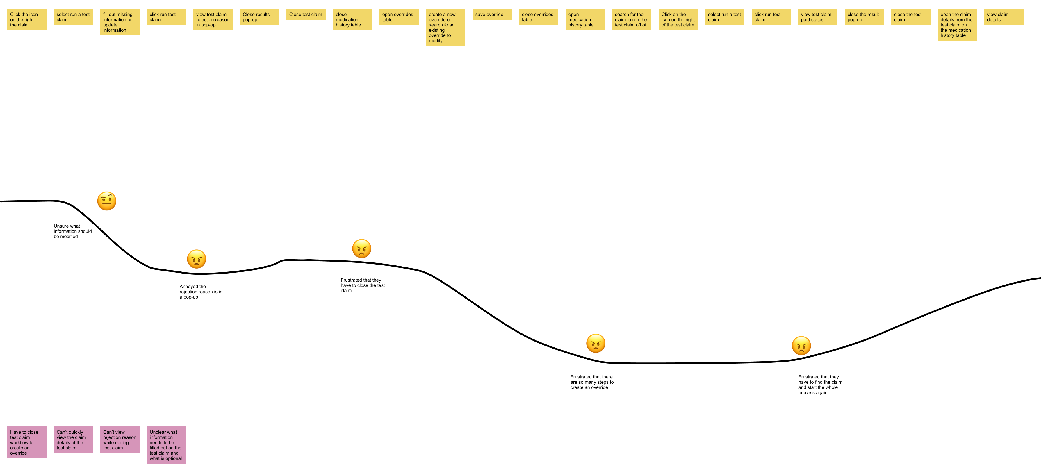
- Usability: users must close the test claim to look at the original claim response, then find and reload it. The rejection decision and additional message aren’t grouped together, and the screen feels like it has had multiple bandaid additions
- Overrides: users must close the test claim to create an override, then find and reload the test claim
- User feedback: they want to easily see the previous claim response, and have to leave the flow to create an override
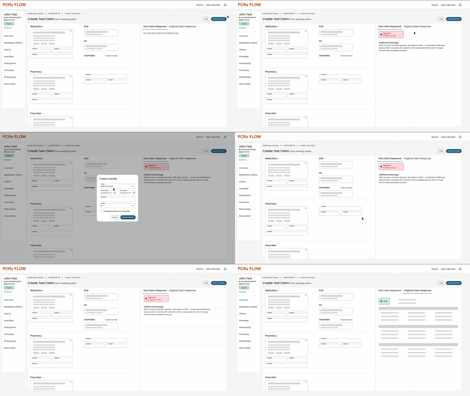
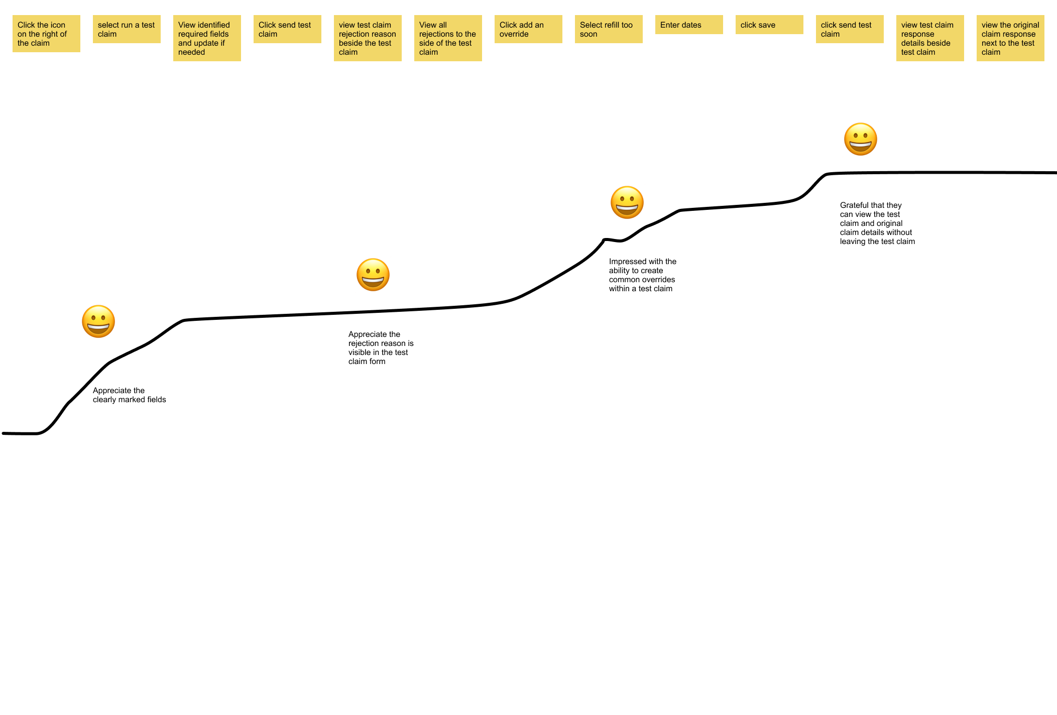
Future state
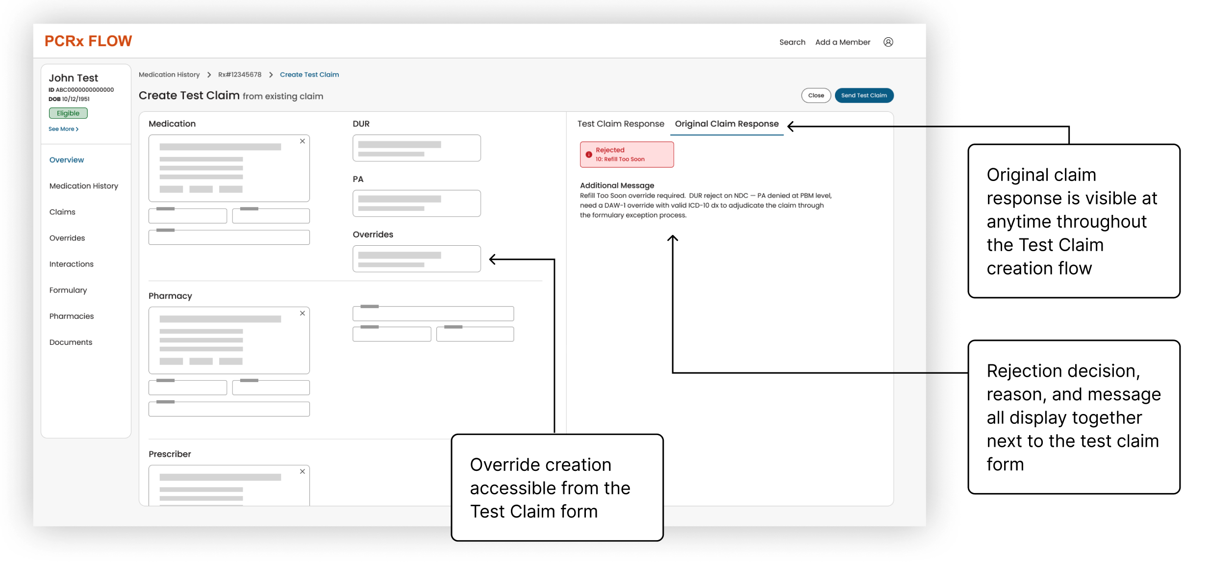
- Supporting task flows are accessible from inside the Test Claim flow
- The original claim response is visible at any time during test claim creation
- Rejection decision, reason, and message all display together next to the test claim form
- Override creation is accessible from the Test Claim form
Additional recommendations
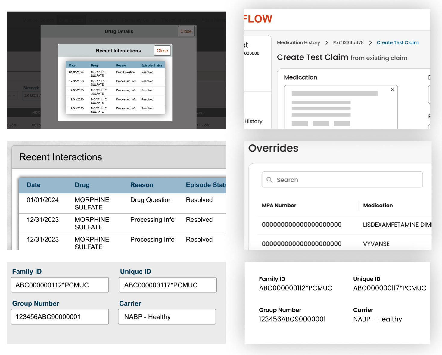
- Dedicated pages: PCRx Flow handles most navigation through modals today. Dedicated pages with breadcrumbs allow for better way-finding
- Tables: tables suffer from the same styling issues as the Member Profile (distracting, bold styling). A minimalist, clean design lets the data stand out more than the design elements
- Read-only fields: Flow uses form fields to display read-only data, which sends mixed messages and hinders scanability. A dedicated read-only pattern should display non-interactive field values
Present for buy-in
From director to CTO
“We need to get this in front of the CTO.”CX/DX Director’s response
“Yeah, this is obviously the direction we need to go.”CTO’s response
Outcomes
PCRx Flow redesign prioritized for 2026
- Received budget and resources to implement a full redesign and create a roadmap for future enhancements
- A Product Manager was hired specifically for this initiative
- The CX/DX Team was now on the map companywide, due to this initiative and my sharing the same presentation in front of an onsite planning panel
- I had the green light to flesh out the concepts for a full end-to-end redesign. See my case study Simplifying Test Claims
*Mockups and screenshots in this project have been recreated from scratch and/or anonymized or abstracted to protect confidentiality.