Unifying the Search Experience
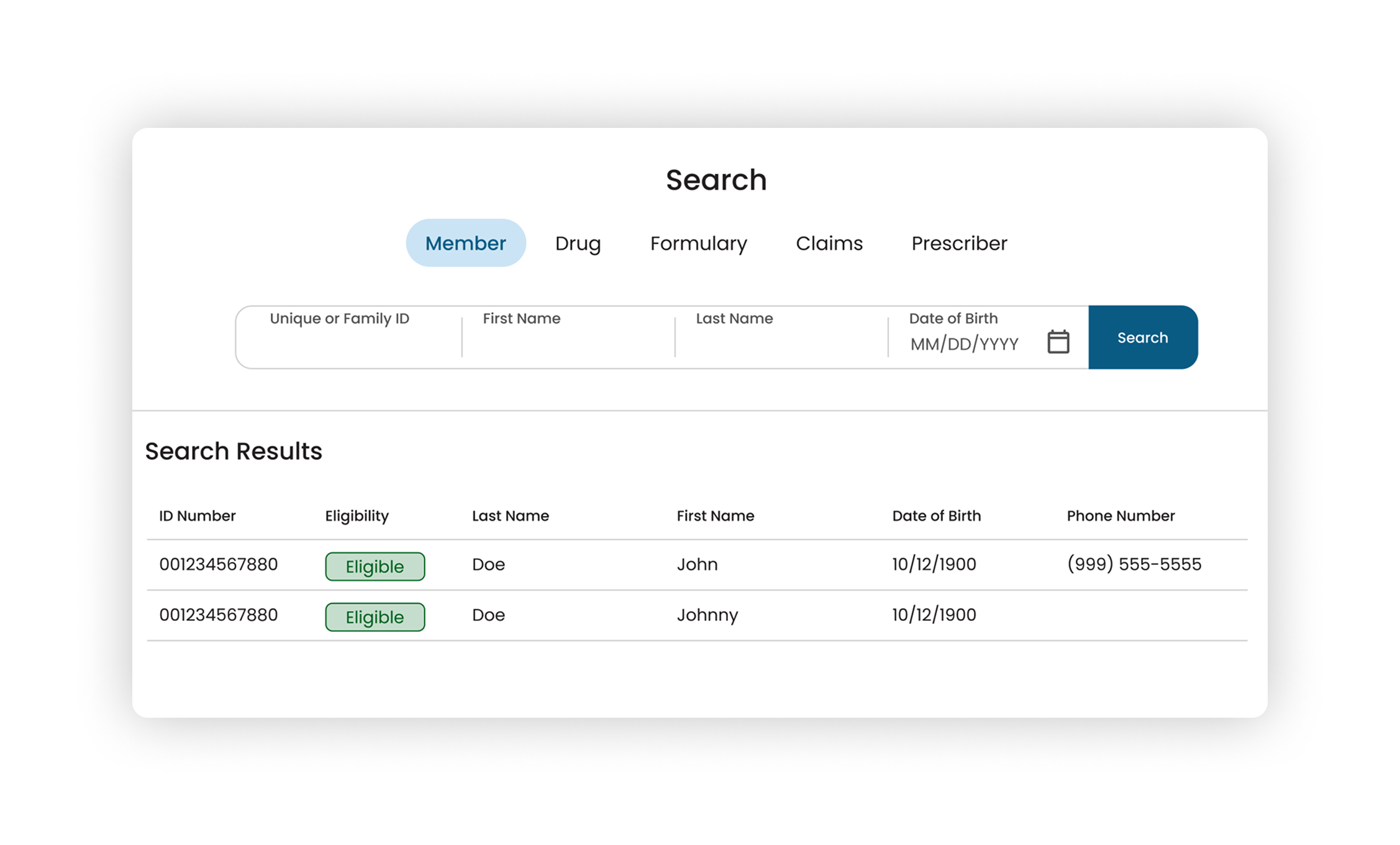
How I used design and interaction decisions to unify the search experience as part of an end-to-end redesign of a client support tool.
Responsibilities
- Interaction Design
- Desk Research
- Visual Design
Timeline & Team
2 weeks, working with a PO and PM for data input
Outcomes
- Delivered a unified search experience that reduces cognitive load and employs predictable visual and interaction patterns
Company overview
Pharmacy Benefit Manager
Homegrown digital tools for everything from claims processing to member and client support.
Project background
- PCRx is the original custom built tool, and the primary source of truth for many of the tools that came after it
- PCRx Flow was a modernized version meant to surface PCRx data for clients, but over time it had become full of reactive, bandaid additions designed by developers and built with aging UI components
Summary of my work to this point
In my case study Resurrecting PCRx Flow, I shared how I leveraged user research and a UX analysis to make 4 core recommendations to senior leadership to improve PCRx Flow.
- As a result, I was given responsibility for the end-to-end redesign, including those 4 core recommendations
- This was part of a transformation initiative in 2026
Focus
This case focuses on the search bar
One of the 4 core recommendations: transforming the search experience, specifically the main search bar.
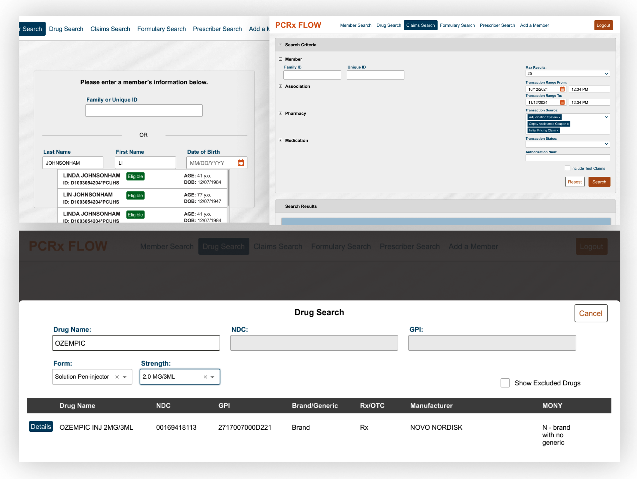
The problem: search was fragmented
Search was spread across multiple dedicated pages, each with its own:
- Layout
- Styling
- Interaction patterns
- Dedicated nav bar menu item
A couple of these weren’t even true dedicated pages, but ¾ height modals.
My recommendation
Combine these search pages into a single, tabbed search page, with layout and interaction patterns common across every type of search.
- Decrease cognitive load: users wouldn’t need to remember a different way to interact with each search type (member, drug, claims, formulary, prescriber)
- Feel intentional: help the app feel thought-out, rather than like each search had been added by a different team
- Improve perception: raise how clients viewed the app and, by extension, the enterprise
The concept was simple: one search bar for every type of search, with results displayed in the same place and the same styling.
Design exploration
It was a lot more complicated than I expected
The rationale was tight in my presentation to senior leadership, but once I was approved to flesh it out, I hit some hard questions:
- How would I handle a Claims Search with dozens of fields?
- How could a Member Search with several fields avoid feeling overwhelming?
Initial concepts
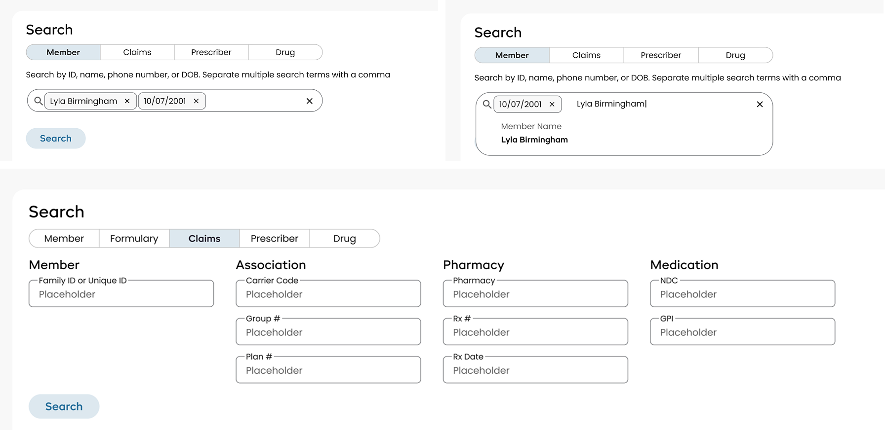
All of them carried the confusing, overwhelming feeling I was trying to get away from in the legacy experience.
Looking at apps that live or die on search
I studied sites like Airbnb and Carvana, which handle very specific, multi-field searches without overwhelming the user with a page full of fields.
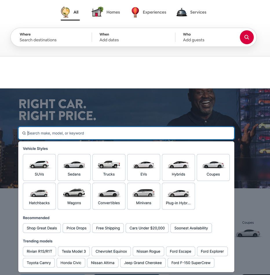
I looked at:
- How their fields were laid out
- How they handled required vs. optional fields
My search had to accommodate complex validation rules to meet performance criteria and limit PHI/PII wherever possible.
Airbnb was the closest match
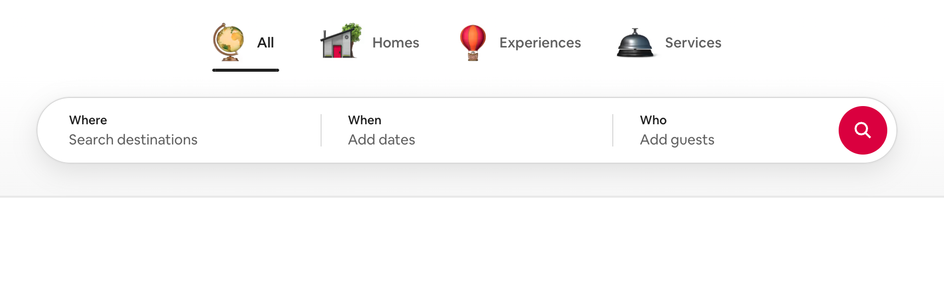
- Users can enter one or multiple inputs to refine a search, and not all are required, just like Member Search needed
- Fields sit side by side so they read as individual fields, but are grouped to feel like a single search bar
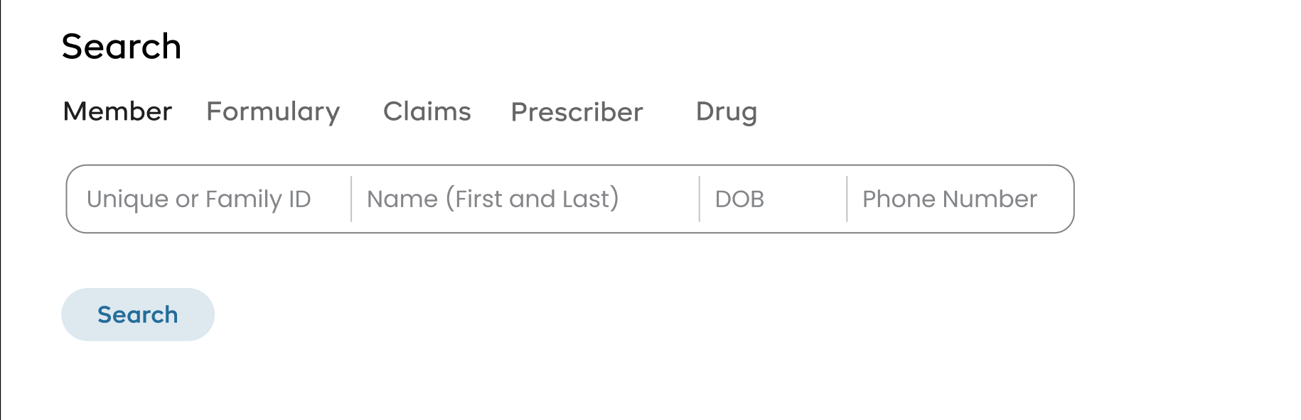
Here is one variation from my exploration applying the concept to my search types:
Design system
A reusable search component
As a founding designer, I could add to the design library, as long as my components were reusable and not so custom they’d only work for my app.
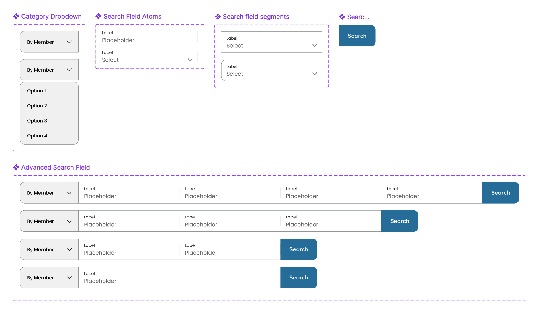
- I created a version that fit the visual language of our design system and added the pattern to the design library
- The basic layout was done for Member Search, with 4 other search types still to go
Months later, I discovered the pattern had been implemented on another app at the enterprise.
Applying the pattern
Drug and Prescriber Search
The main difference from Member Search was the need to search by sub categories, like NDC, NPI, and GPI. Adding a dropdown was simple enough, but which option should be the default?
Data over assumptions
- Proxy users expected NDC to be the default
- The Grafana dashboard for drug searches showed GPI was actually the most commonly used
So I set the order to GPI, then NDC, then Name.

The goal: let most use cases move forward without ever opening the dropdown.
Applying the pattern
Claims Search
The most complicated search type, and where I questioned whether I could make it work without breaking the search bar pattern.
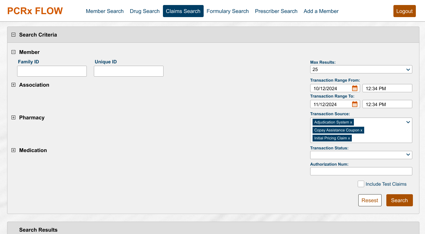
The legacy experience
- An accordion of categories, each expanded and filled out to narrow down results
- When expanded, the form took up the entire screen, leaving no room for search results to be discoverable
Early ideas felt disjointed
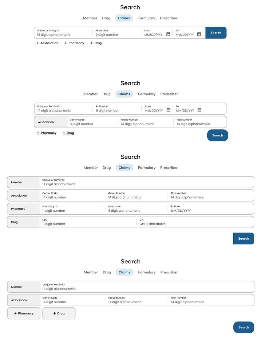
Eventually I landed on putting the additional fields into a container visually attached to the search bar, without increasing the size of the search bar itself.
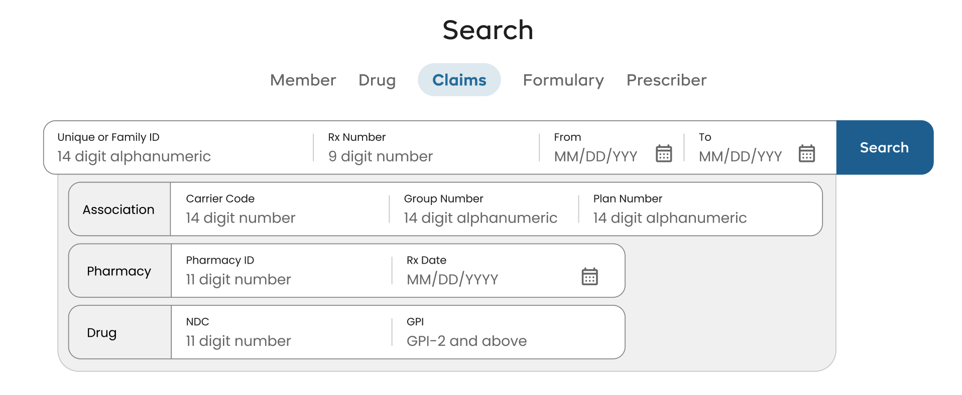
Surface the common, hide the rest
A pattern I’d used throughout the redesign: bring the most commonly used fields to the forefront, and tuck the least common behind an expandable section. It made long forms approachable, where before they felt like being lost in an IKEA store.
I requested a Grafana dashboard for Claims Searches from the PO and PM, which showed:
- ID, Rx #, and Date Range were the most commonly used by far
- Source was required
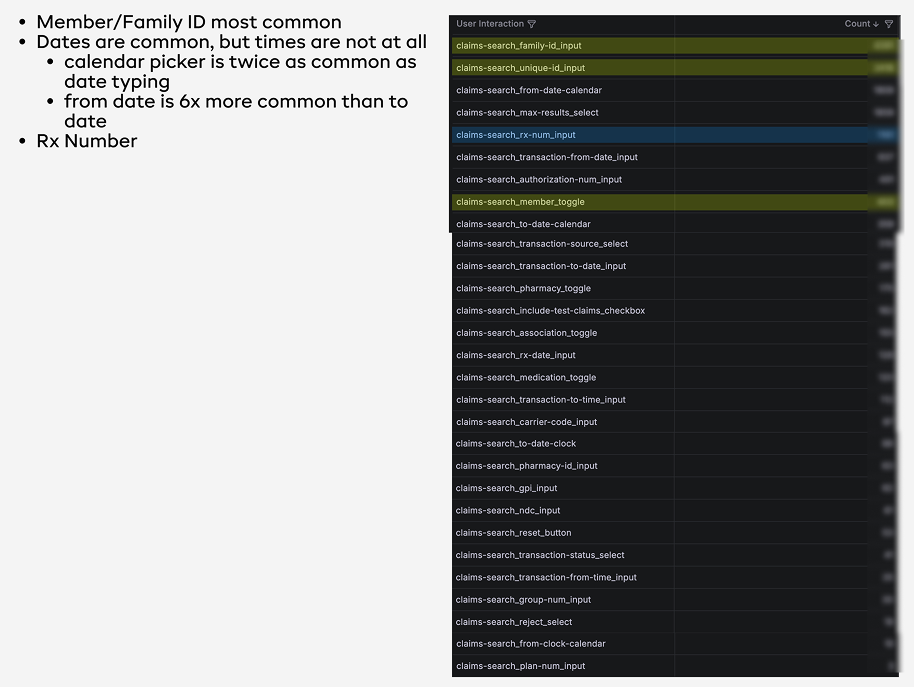
Those fields went into the search bar. Everything else moved behind an Advanced Search button, grouped by its legacy categories.
Validation
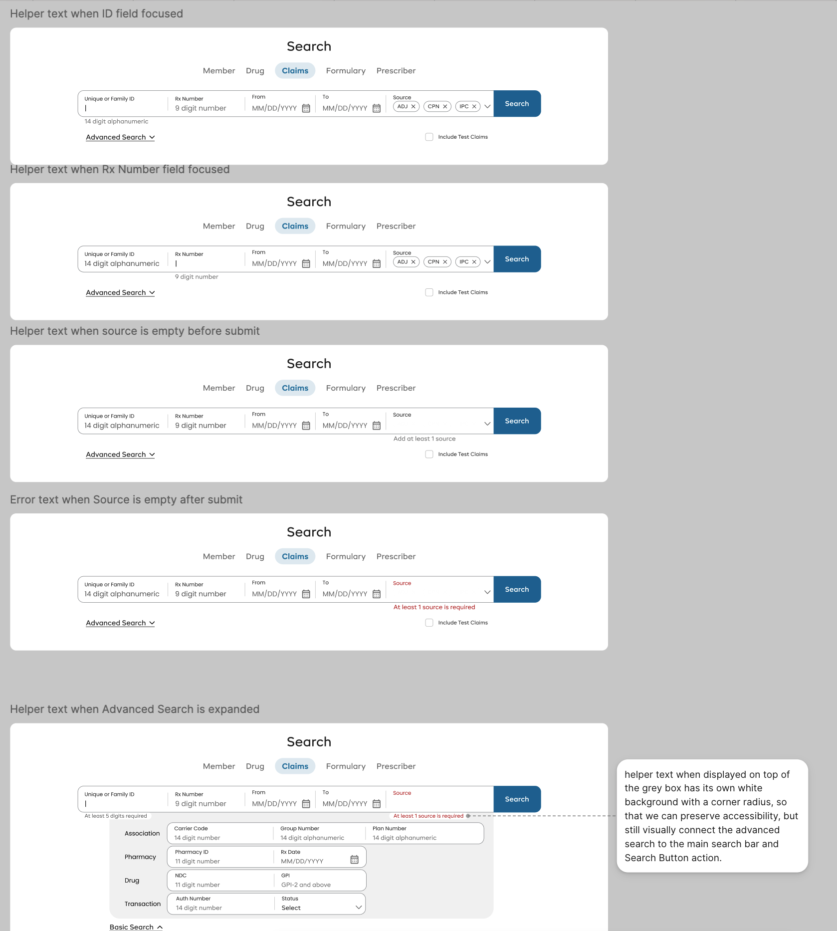
Guidance vs. errors
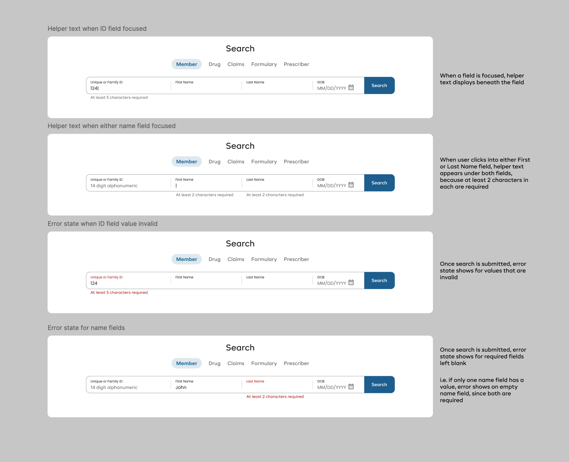
The validation logic didn’t change in this redesign, so I focused on presenting the messages in a user-friendly way.
- Legacy: all validation displayed as an error, in red text
- Redesign: I distinguished between guidance and errors
- Guidance appears while the user is typing, in a neutral color
- Errors appear only when the field loses focus or search is clicked, in red
Removing an unnecessary hassle
- Legacy: if an accordion section was expanded, you had to enter values or close it before searching, which was very frustrating
- Redesign: validation still occurs, but expanding Advanced Search no longer makes fields required simply because they’re visible
Prototype
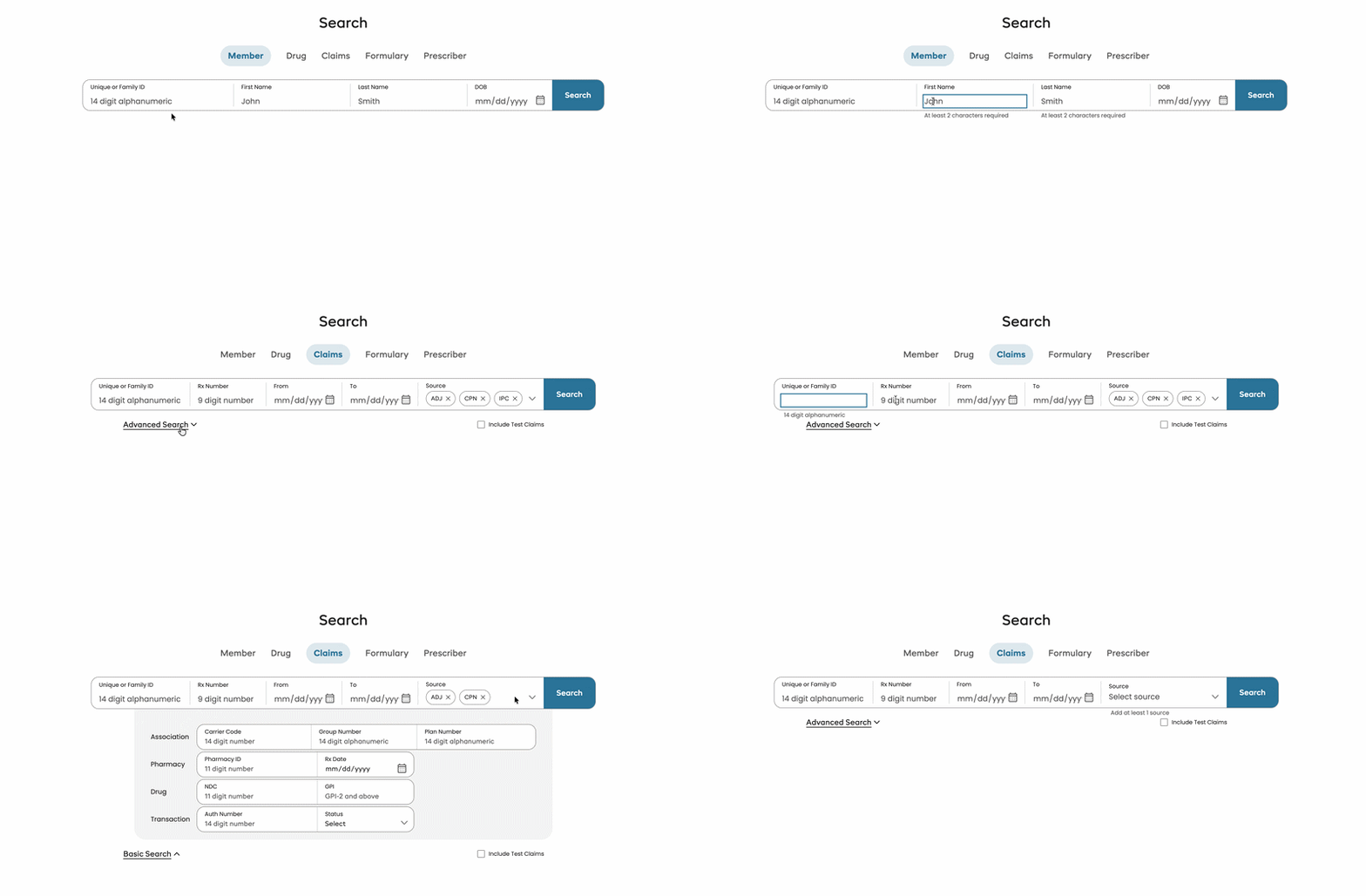
The final experience
Outcomes
A unified search experience, shipped behind a feature flag
- Through developer review, built, tested, and shipped to production
- Currently behind a feature flag, awaiting go-live in early 2027
- The search component was adopted by another app at the enterprise
Through visual and interaction design, I delivered a unified search experience that reduces cognitive load and employs predictable visual and interaction patterns.
*Grafana screenshots in this project have been recreated from scratch and/or anonymized or abstracted to protect confidentiality.